Reimagining Ricoh Insurance Claims Management Flow
2024 Summer UX Design Internship Project @ Ricoh USA

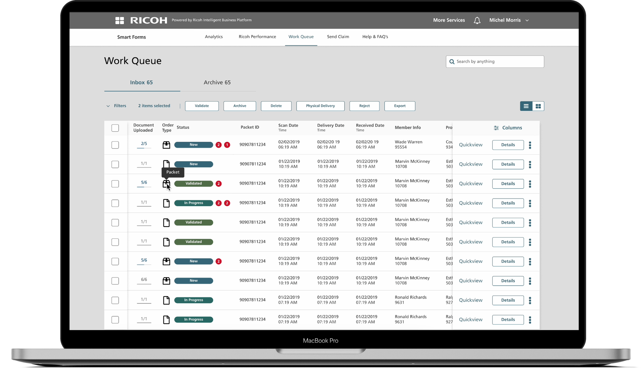
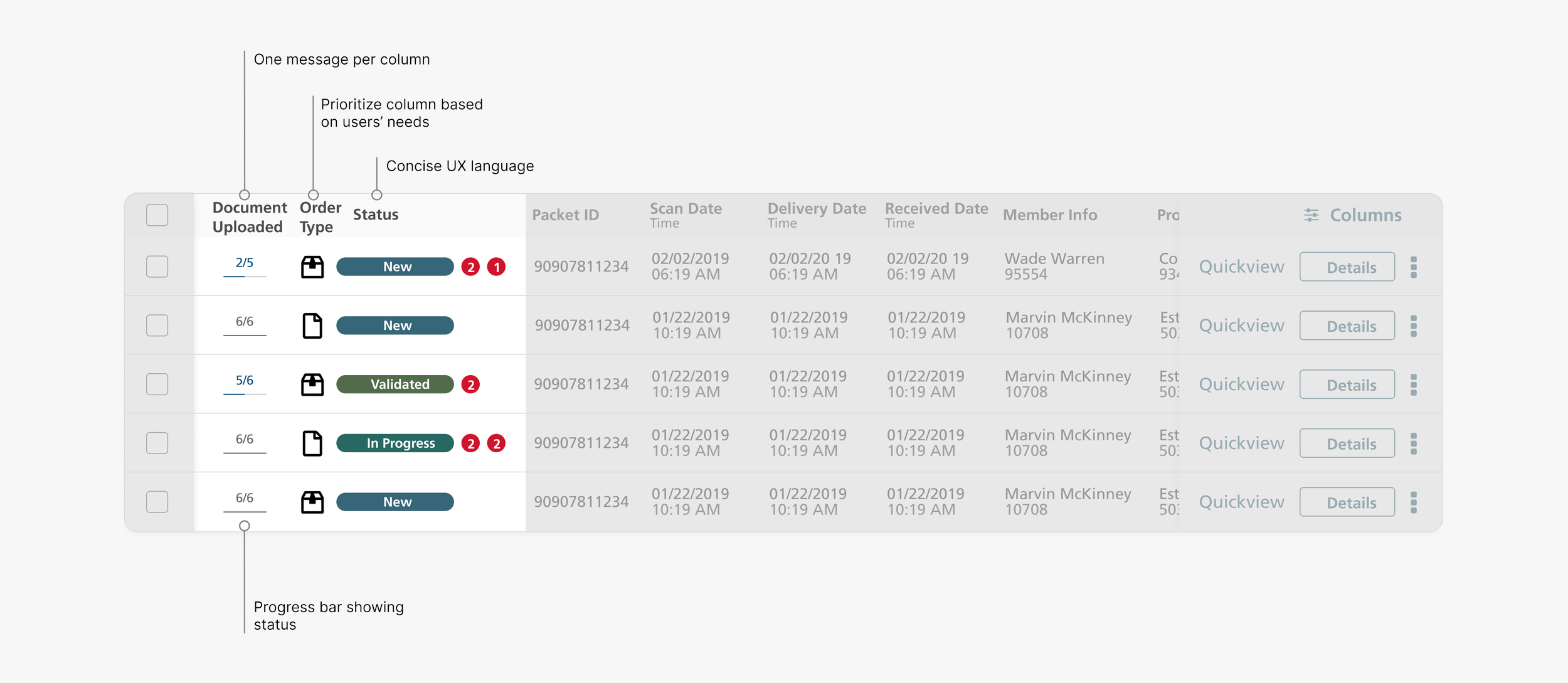
Claim Work Queue
The Claim Work Queue shows all claims assigned to you, whether single documents or multiple documents in a packet, along with the status of each form, uploaded or pending, so you can easily track, manage, and prioritize your work.
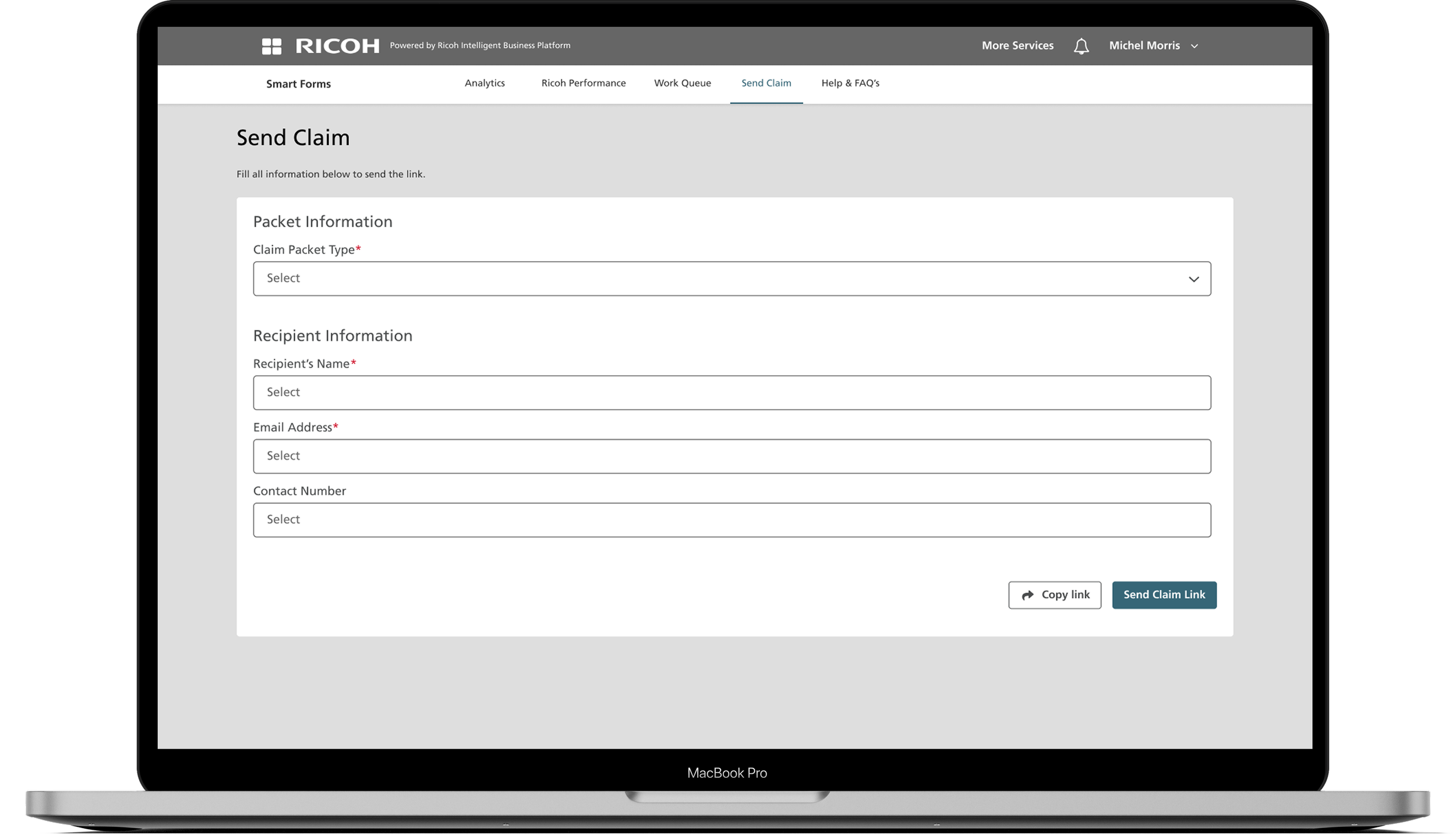
Send Claim
The Send Claim feature lets you quickly send claims to your end users. Just enter their information in the platform, and the claim is delivered directly, making the process simple and straightforward.
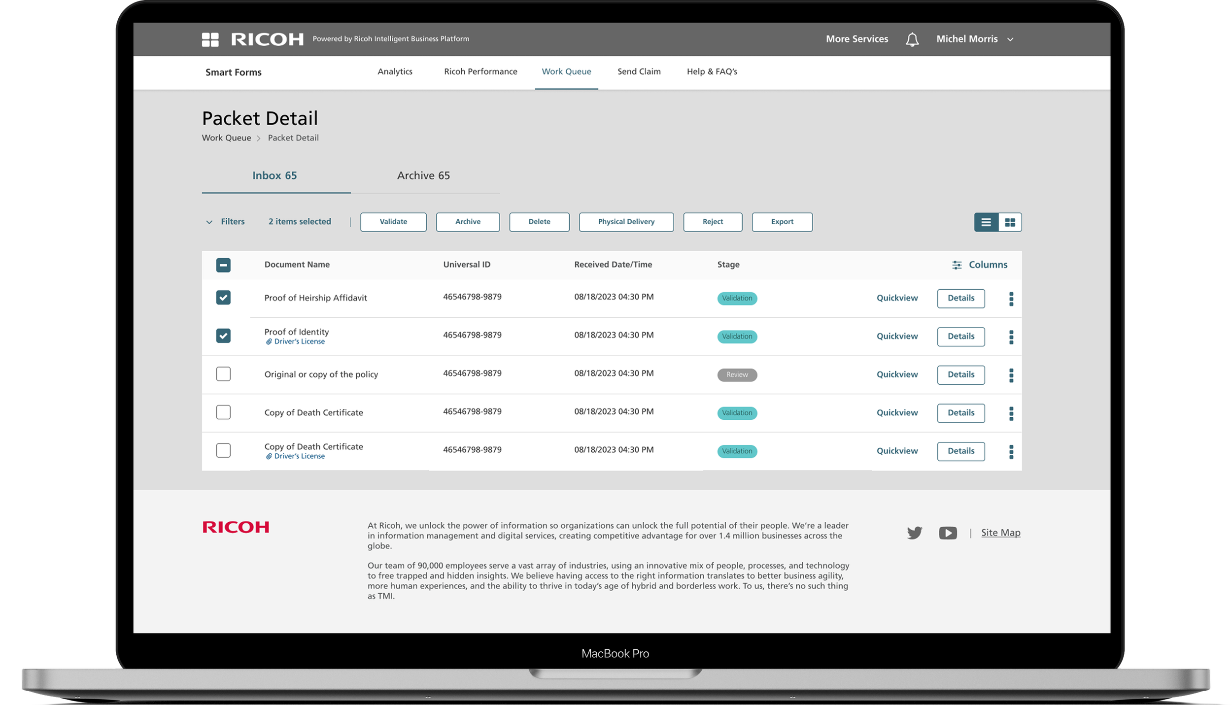
Packet Detail
The Packet Detail feature lets you view all documents within a packet, including each document’s ID, the date and time it was received, and whether it requires review. From here, you can also select the next document you need to validate, making it easy to manage and track your work efficiently.
So, how did everything get started?
Ricoh, a global electronics company looking to grow in the B2B sector
Yes, you might know Ricoh for its electronics. During my time at Ricoh USA, I worked on their B2B sector.
Ricoh saw a significant opportunity in insurance management, where administrative costs reach $158B annually. With that in mind, I helped my team reimagine what insurance forms could look like.
Why redesign? What’s wrong with the current system?

Meet our client, Michael
Michael is a claim manager at an insurance company. Everyday he needs to review and validate hundreds of claim forms submitted by clients. When there is a lot of forms coming, it could get very overwhelming.
How might we make it easier for claim manager to organize and process claim forms?
Understand the problems with Product Manager
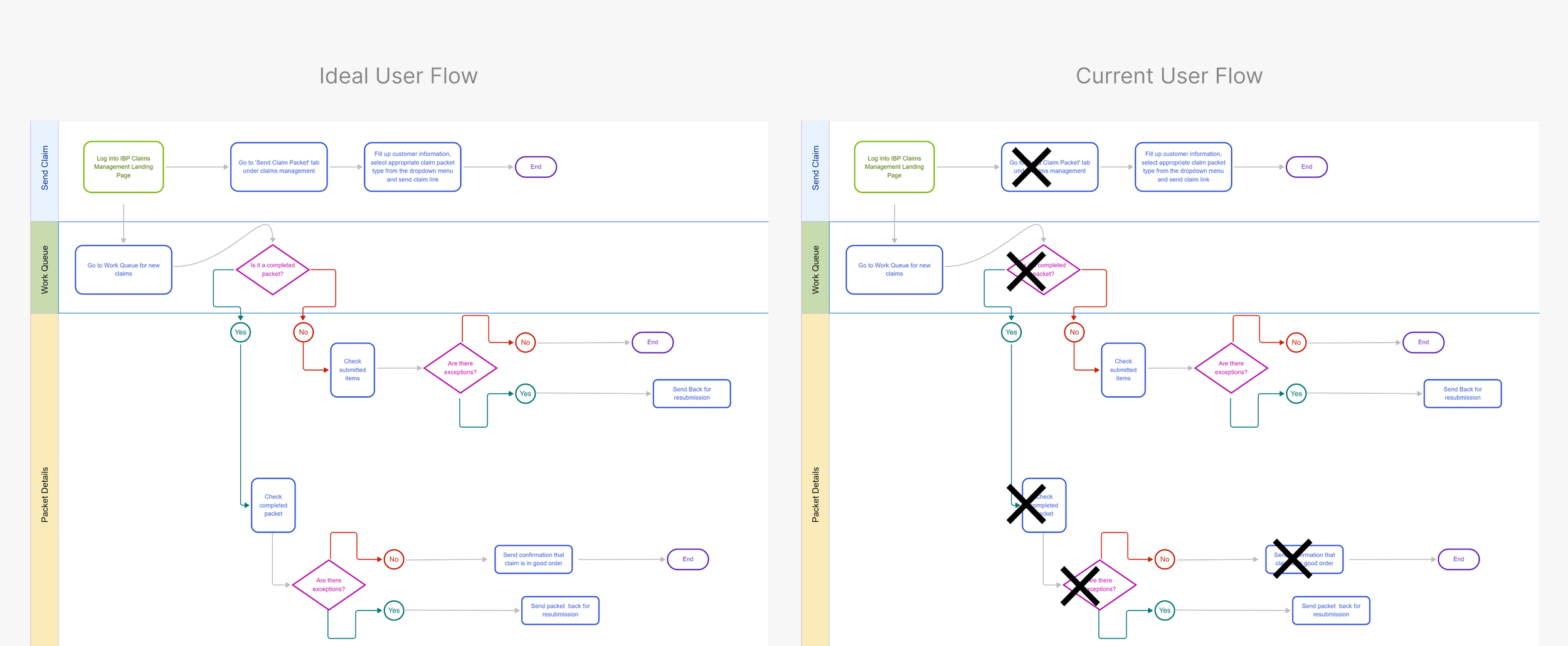
Working with our Product Manager, we started by mapping the current user flow from login to form validation, observing how claim managers navigated the platform, and identifying usability pain points through task-based testing
It quickly became clear that Michael’s frustration wasn’t about the number of forms — it was about the lack of visual logic.
Design with interations
Throughout my design process, I explored multiple iterations to refine and improve the experience.

Iteration 1: Show me what I care
From our clients, we learned that clients care and want to see different claim types, either it is a packet document or packet document.
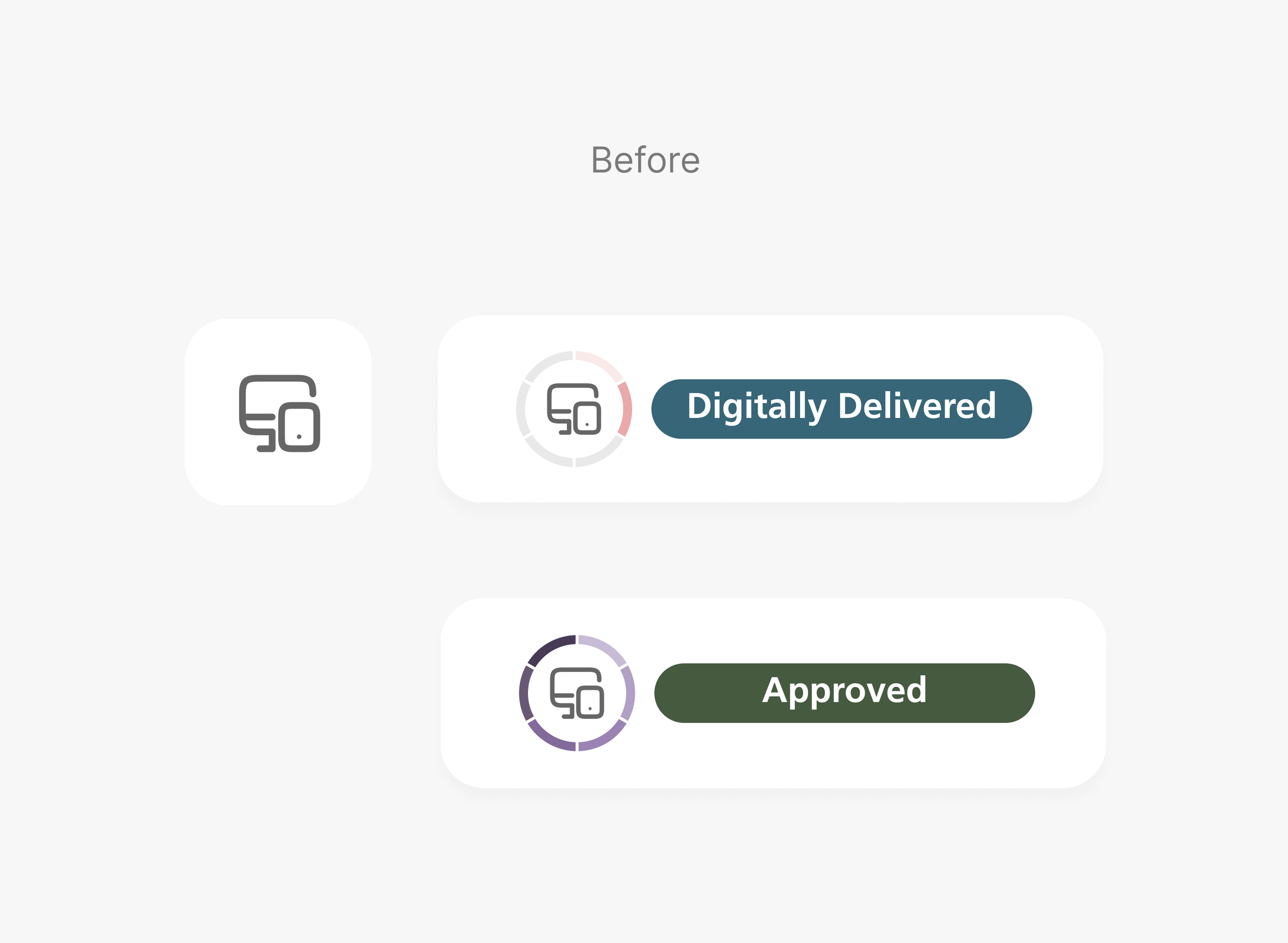
Icon does not show packet type
Current icon does not show two different claim types, it only shows if a document is digitally delivered
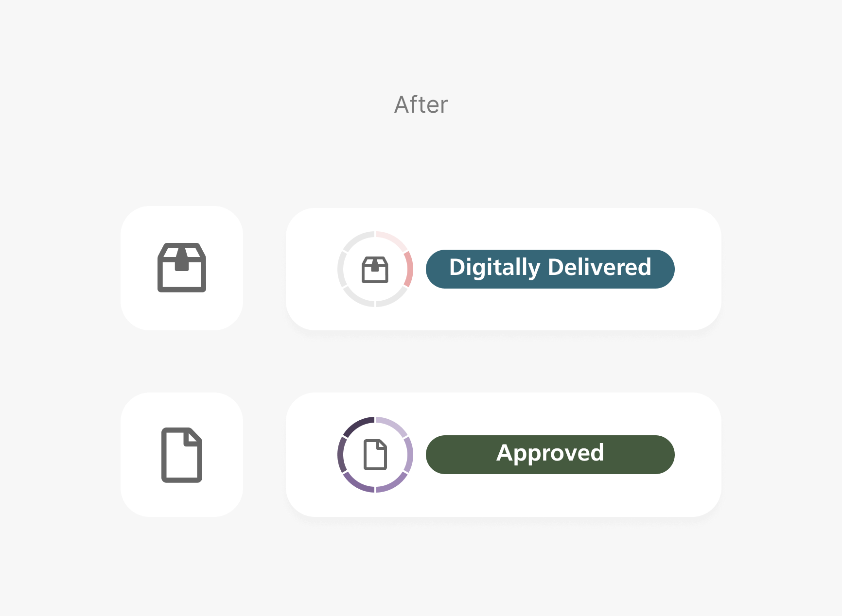
Two different icons showing status
One icon shows packet claims, and the other shows individual claims
Iteration 2: Why so many colors?
Well, that solved one of the problem Michael is struggling with, but it is still confusing for Michael, why is there different colors and what are the color differences? Users are confused by the color and circular status
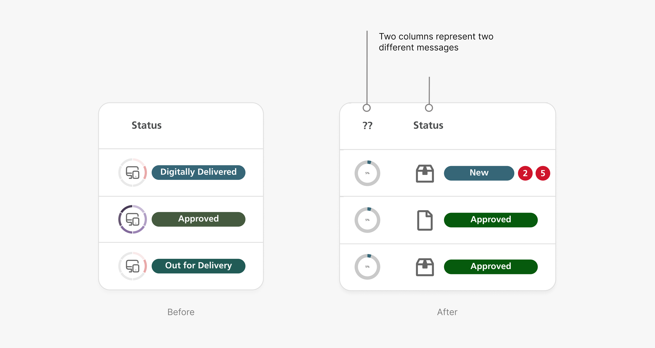
Iteration 3: Show Me How Far I’ve Come
Well, that solved one of the problem Michael is struggling with, but it is still confusing for Michael, why is there different colors and what are the color differences?
What I learned
👉 Design with business mindset
Design is not just about making things look pretty. It’s about creating solutions that drive business value and solve users’ problems. While working with a Product Manager, he mentioned that one of the design version worked well but would be too expensive to build, and he wanted me to build upon the existing design. This is why thinking about business is an important part of design. Design won’t be implemented without business considerations.
👉 Design is an iterative process
Design is a process of trying things out and tweaking them. The different versions I worked on, plus input from co-workers and mentors, helped me land on the final solution in this case study that you see!